
There are many eCommerce websites, but there aren’t so many that really make you want to look around and shop.
Many of them fail to stand out from their competitors because they haven’t worked on the copy and they believe professional images are all they need to incite visitors to buy.
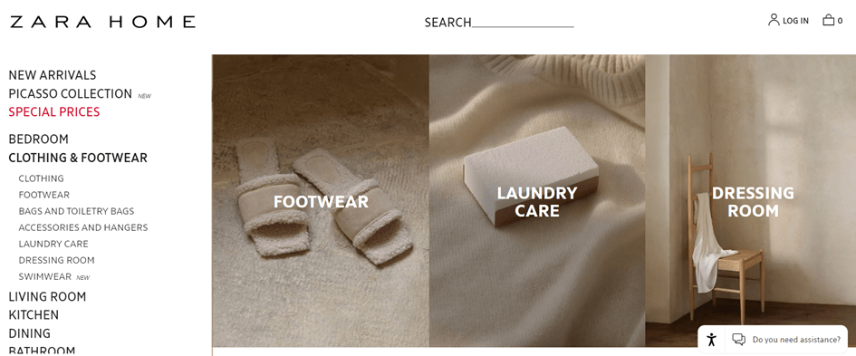
Yeah, if you are Zara.
But if you’re a little known brand, you’ll have to accompany those images with suggestive copy that will make prospects want to receive your products straight away.
And it’s not only the copy that is important, there are other factors that come into play too to make an ecommerce website work.
Let’s see each of them.
1. A distinct brand voice
Having a unique brand voice is really important. You should work on yours at an early stage when you’re designing your packaging or logo.
Your brand voice is what will make people recognise you in a million and what will turn your customers into fans of everything you offer.
Creating an original and consistent brand voice might take you some time.
The more you know your target audience and your own product, the better you’ll be able to define that voice that makes you unique.
There are exercises that help you define your voice. These are 4 exercises I do with my clients:
- The celebrity
- The living room
- The dinner guest
- The list of adjectives
In this article I explain how to do each of the exercises. They’ll help you find your own voice, so don’t skip them.
Observe other brands in your niche and DON’T DO ANYTHING LIKE THEM.
This is a big problem I see all too often. Brands are scared of being different and they just copy and repeat buzzwords, colours, and techniques, that others are using.
And they expect to stand out doing this!
If you really want to get noticed you have to dare to do things differently.
It’s ok to get inspiration from others brands you admire. But it’s one thing to take some ideas and quite another to literally copy what they’re doing.
You probably know the brand Innocent, those smoothies you can find all over the world.
Innocent’s voice is recognisable among many other brands because they’ve worked on it from the start, when other companies in their niche were still in the status quo, thinking that what would take them to the podium was to spend lots of cash on TV commercials.
Innocent was created by a group of friends who wanted to do something different. Dan Germain is the copywriter behind its voice and one of the owners.
They started writing mini-stories on the labels of their smoothies and found that people read them and even wrote to them to tell them what they thought of the story. Sometimes they considered it shit and other times they loved it.
The point is that they were creating a conversation with the consumers and slowly building their own community of fans.
Since those early days when they were just a small team, many years have passed -more than 20- and now they’ve got a team of copywriters from all corners of the world who write in different languages.
They continue taking care of their brand voice by writing original copy for each country so as to adapt the message to each culture.
I don’t doubt their smoothies are excellent too, but it’s clear their brand voice has helped them a great deal to sell their products all over the world.
Dan Germain says in The Copy Book:
“In the beginning, we didn’t know what we were doing. We didn’t know how to make drinks, we didn’t know how to design packaging, and we had no idea about marketing. But we tried.”
So go ahead and try doing things your way.
Recommended reading: 5 essential components of a brand with personality
7 #design and #copywriting elements your #eCommerce can’t miss Share on X2. A homepage that makes you want to stay
Some homepages are frightful.
A variety of elements following no logical order, cheesy headlines worthy of Valentine’s cards, not enough white space to breathe…
An eCommerce has to be a pleasant experience from the moment you land on it.
It’s just like in a break and mortar shop.
If you go into a shop and, as soon as you get in, you find several shelves of products stacked up that have little to do with each other, there’s no space to move around and you can’t find a shop assistant anywhere to ask about features and price, you most probably will get the hell out of there.
The same happens online.
Your website should be tidy and clean, with enough white space between images and text, well-designated sections, perfect images and copy specially crafted for your target customer.
A good structure of a homepage can look like this:
| MENU |
| COMPELLING HEADLINE |
| SEASONAL OFFERS |
| IMAGES WITH CATEGORIES TO CLICK AND SEE MORE PRODUCTS |
| OPTIONAL : Section with a short story about the brand. If people want to know more they can click on a button that takes them to a slightly longer “About” section. |
| OPTIONAL : BLOG |
| FOOTER WITH SUBSCRIBE BUTTON AND SECONDARY MENU |
Avoid these mistakes if you want your website to attract more business:
Too many buttons
Your homepage is not your product page.
The goal here is not to nudge them to buy your products straight away but to get them interested in your brand so they’ll want to see what you have to offer.
Add your best products as a hook to get them to see more but don’t clutter the page with too many elements.
Although, there are brands that like to have their pages cluttered up and it might work well for them.
It depends on the style you want to give to your brand. (Minimalistic, Kitsch, Elegant, etc.)
The living room exercise in the first section will help you decide what you want the experience of your visitors to be like. But be aware: too many options can be overwhelming.
Too many different colours
I love colours. I feel they bring joy and my house is full of colourful Mexican and Peruvian cushions.
But this doesn’t work on a website.
Many colours can become confusing and hide call-to-action buttons (CTAs) those buy, subscribe, etc. buttons that you want your prospects to click.
Better choose 3 colours max and be consistent.
If you started using orange CTAs, then make them always orange, so your prospects can identify them quickly.
Elements that move too fast
Web designers love elements that move independently. But they often distract prospects from taking action.
Remember those times when you’re reading something and it suddenly disappears, and so does the next slide?
It’s stressful and annoying.
Let your prospects click next when they’re ready.
7 #design and #copywriting elements your #eCommerce can’t miss Share on XA bland headline
The headline and first few sentences need to summarise why people should stay and have a look at your shop.
Your headline needs to express in a few words what your customers will take away and why you’re different.
Here are some examples of original headlines and slogans to inspire you:
Firebox – is where you go if you want to buy an original present. Its headline says “Shop for the Unusual“
Woot – It’s an Amazon company that offers only products at discounted prices and its headline says “Don’t work to find deals. Let the deals find you“
Backmarket – A shop for refurbished products, its headline “Le (super) marché du reconditionné” – Translated – “The (super) market for refurbished”.
Pip&Nut – “Natural Nuttiness” and the subheadline “Award-winning natural nut butter”
Winning headline = Benefit + powerful/catchy words
Recommended reading – The powerful formula to create winning headlines
3. A super well-organised main menu
When you have many product categories you have no choice but to add drop-down submenus.
If you have a lot of categories better to use a menu on the left margin with a search bar like the big fashion brands do.
Categories should be well organised following a logical order so visitors can quickly find what they’re looking for.
If you don’t have so many categories you can add your menu at the top of the page, but only if you have 5 categories max with 5 or 6 options each.
In case of more options, a side menu will be better. It doesn’t take the whole page when displayed and it looks cleaner.
Use the footer menu for the less important sections of your website (cookies policy, blog, address, opening hours, etc.).

4. Professional (static) images
Images in eCommerce are the second most important element.
You might be surprised by what I just said, but it’s true.
A pro image without a good story/description behind it may fall short and not motivate the purchase.
Later in this post, I give you a very clear example of what I mean. I talk about an eCommerce that makes its product descriptions its most important value, but we’ll see that in the next section.
The photos of your products have to be super professional, of course, and better if they don’t move on their own so prospects can take the time to look and click next when they want to see a different angle or another product.
Videos can work if you think your product needs to be demonstrated.
If you add a video set it on mute by default so it doesn’t play loud unexpectedly. Then people can click on the speaker button if they like.
If it’s an explanatory video, add subtitles for those who don’t want to unmute it.
7 #design and #copywriting elements your #eCommerce can’t miss Share on X5. Product descriptions that make you want to receive that product right now
Describing a product is an art.
There are online shops that only describe the features and materials of a product, without realising they’re missing a golden opportunity to show their brand’s personality.
And then there are brands like Loved Before that has made of their descriptions their unique value proposition.
Loved Before is an online shop that sells second-hand teddies. Their headline “Saving the Planet, one teddy at a time” already implies a big benefit. You’ll feel better buying a teddy from their shop because it’s a greener option.
The sub-headline reads “A soft toy adoption agency with a difference“.
They don’t sell used soft toys, but are an adoption agency for orphaned cuddly toys – a big difference!
Every soft toy they sell has a story behind it, just like Linda:
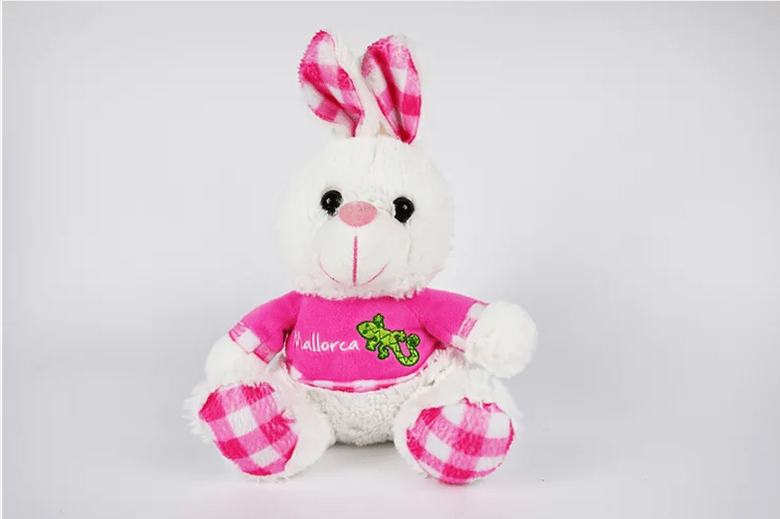
“Linda loves sleepovers, sleeping bags and eating sweets at night. But most of all she loves chatting all night long and falling asleep with her best friend.
Each cuddly toy has its personality described in a couple of lines.
Like Bobby:

“Bobby is not a morning bear, if you need him be sure to wait until the afternoon to ask him a question. Any other time you’ll just get a grunt.”
All the value of these cuddly toys lies in their personality described in a few words. Further down we can read the practical details, materials, measurements and weight.
Can you imagine the difference if they had only added the characteristics?
In this article, I give you more examples of brands that write excellent product descriptions and talk about the elements you shouldn’t forget to add.
7 #design and #copywriting elements your #eCommerce can’t miss Share on X6. A crystal clear purchasing process
Browsing your online shop has to be very easy. The instructions and messages that help your prospects navigate through the purchase process need to be crystal clear.
The field of copywriting that specialises in these messages is called UX copywriting. The acronym UX stands for “User Experience”.
UX copywriting focuses on making the user experience when visiting your website or using your App as pleasant as possible.
Words play a very important role when you rely on users to perform specific actions, such as buying a product or subscribing to a newsletter.
Words have to be well thought out and strategically placed to facilitate the process of buying or using a tool.
You should think of all possible situations that can happen, for example, “The purchase was successful” or “Purchase cancelled. The payment could not be made”, and always use clear, precise, concise and positive language.
Let’s take a look at these 4 language attributes that you should use in all messages and instructions on your website and App.
Clarity
Remember: you’re the expert so don’t assume your prospect already knows everything. You know your business and your website better than they do.
Help them navigate your site easily and find what they’re looking for quickly.
Write with clarity in mind and don’t leave out important information.
Use simple words that everyone understands, your website is not the place to show off your extensive vocabulary.
If you have to use a technical word people may not understand, explain it. Write like you speak. One trick to make sure you sound conversational is to read your text out loud to catch any expression that feels unnatural.
Precise language
People don’t want to have to think too much, so give them precise instructions on what to do next.
For example, don’t say:
Update your preferences to receive fewer notifications from us
Better:
To receive fewer notifications, go to Preferences > Email notifications
To be more precise and clear you also need to be consistent. Make sure you always use the same terms to describe the same objects or actions.
For example, if you use the word “newsletter” in one place, don’t call it “bulletin” in another. Decide which one you prefer and always use the same one.
By being consistent with your choice of words, you reduce the number of things your prospects need to understand and remember.
Concise language
Less is more (almost always). Try to be as brief as possible but always make sure the main idea is clear.
Use short sentences and watch out for wordiness.
For example instead of saying:
“If you haven’t already done so, you can subscribe to our newsletter to receive special offers and promotions sent directly to your email inbox.”
Better:
“Subscribe to our newsletter to receive special offers”.
Try to express a single idea in each sentence.
Talk to your customers and not about yourself.
For example instead of saying:
“We are proud to announce that we have introduced 15 new products to our catalogue”.
Better:
“We’ve added 15 new products to the catalogue – check out what’s new!”
Positive language
Beware of negative language, it’s always less friendly and often longer.
Instead of saying:
“You can’t go on if you don’t identify yourself”.
Better:
“To continue, please enter your username and password”.
Sometimes we have to give bad news. This is when it’s better to use the passive voice, which it’s not the best option as a norm.
For example instead of saying:
“Your credit card has been declined. We have cancelled your order”.
Better to say:
“We haven’t received your credit card authorisation. Your order has been cancelled”.
Try not to make even bad news sound too negative and above all never blame the customer for what went wrong.
7. A great incentive for subscribing to your email list
A customer who has already bought once from you is more likely to buy again. But you need to remind them.
That’s why you should work on your email strategy. If you want customers to subscribe to your emails you should give them a good incentive.
Most online shops offer a certain discount -almost always 10%- on the first purchase.
But there are other ways too:
- A small free gift with the first purchase. It doesn’t have to be something of great value, because… Who doesn’t love a freebie?
- A guide with a lot of value for your customer. Depending on what you sell, you can think of valuable content your customer would like to receive for free. Recipes, a guide to haircuts that best suit the different face shapes, a guide to travel by train. There are hundreds of topics that could interest your customers.
- Give a percentage of their first purchase to an NGO. Many people want to help but don’t know how to get involved, if you make it easy for them they’ll be more inclined to do so. They’ll feel better about their purchase.
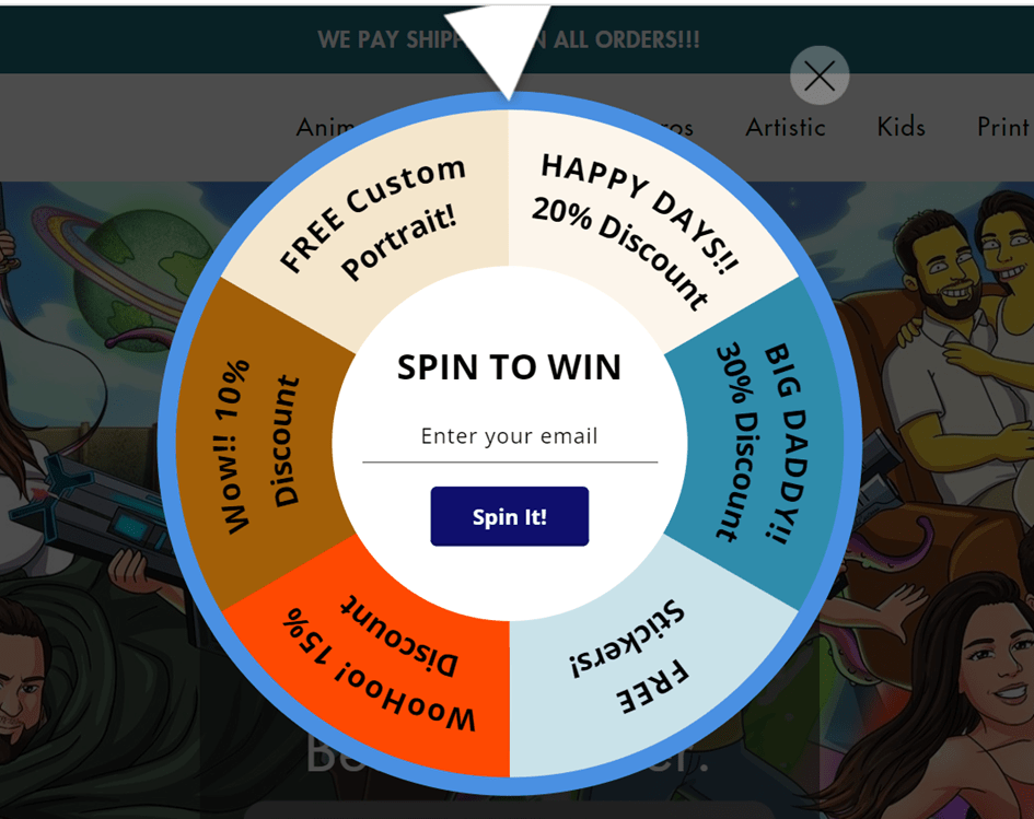
- Playing roulette. I saw this on a site and I thought it was great because it gives the customer the opportunity to play and that anticipation before knowing what they’ve won will surely encourage many people to enter their email.
I hope these copywriting and design tips for your online shop or eCommerce will help you improve your website and sell more.
7 #design and #copywriting elements your #eCommerce can’t miss Share on X
0 Comments