
After doing dozens of website reviews I’ve realized that most businesses make these 5 mistakes.
Such mistakes prevent these websites from accomplish their main purpose, which is to win customers.
Whether they are selling a product or offering services, most businesses make these 5 mistakes, which, on the other hand, are very easy to correct.
They are mistakes of design and strategy.
No matter how good the web copy is, if the design gets in the way, it’ll be much more difficult to convert visitors into customers.
Design and copy must go hand in hand always.
A trendy and attractive design with wishy-washy copy which doesn’t touch prospects’ emotions won’t sell.
And if the copy is specific, clear and convincing, but the design gets in the way, preventing the person who lands on your website from reading it easily, the result will be just as disappointing.
A website works when it has compelling copy designed for the target audience and a clean and amicable design.
And by amicable I don’t mean funny, but a design which is a pleasure to interact with.
Because it’s intuitive and takes the prospect by the hand, guiding him to the next step we want him to take.
This step can be to contact you, to buy your product or to give you his email address.
If you want your website to convert avoid these 5 design and strategy mistakes that are sabotaging your income.
1. A home page that looks like a flea market
I’ve seen home pages you wouldn’t believe.

Some of them make you want to run away.
And this is precisely what happens to most prospects who land on a page like this.
Crowded text, lots of moving elements, blocks in different colours, margins offering several lead magnets, many calls to action placed together…
If you have a home page like this you’re throwing stones at your own roof.
The first thing you need to ask yourself is why that person has landed on your website.
They may have found you after googling some keywords, or they may have read a post on your blog and then gone to visit your home page.
Once you put yourself in their shoes you have to think about how you can help that person find easily what interest them.
If you add too many things to your home page you will confuse them and they won’t know what to do next.
Does she need to fill your contact form? Does she have to download your product demo? Or maybe look at what services you offer?
If you give her too many options too early on, she’ll most likely feel overwhelmed and leave.
Remember, your homepage have 3 main goals:
– Clearly show at a glance what you offer and what kind of customer it’s designed for
– Encourage prospects to click on links to your other important pages, such as your Services and About.
– Include an attractive CTA prospects will click to leave their email address in exchange of your lead magnet.
Recommended reading How to create a lead magnet that attracts a whole bunch of customers.
All that information needs to be arranged in a logical order.
And it’s important to add lots of white space so people can breathe. This is called a clean website.
For inspiration take a look at these sites:
A freelancer: https://dayanamayfield.com/
An ecommerce: https://cocunat.com/
SaaS: https://balsamiq.com/
2. Carousel of testimonials
If you don’t listen to my advice on the other points, please at least listen to me on this one.
It’s something designers love…
Things that move.
But the truth is that no one wants to feel like they are on a merry-go-round.
I even get that same knot in my stomach when I try to read testimonials that disappear faster than what my eyes can read.
And I’m a fast reader! I’ve been watching movies in original version since I was 15.
Please don’t make your visitors dizzy.
Social proof is one of the most important elements of good copy.
If you want your prospects to trust you, testimonials are the best option to proof your value.
If you have great testimonials but people can’t read them, what’s the point?
So please ask your designer to leave them alone (static) and not get too excited by adding in too many elements that move (photos, slides, etc.)
Unless you are ZARA and have on your home page videos of models posing at home in a super natural way.

3. Drop-down menus
Sometimes you see menus that have 10 options…
Do you really think people are going to read every single one of them?
No way Jose.
Prospects aren’t going to take the time to read all those choices, and what’s more, seeing so many options is going to stress them out.
I know what you’re thinking, but I do offer different services and products and I need to show them.
Okay, I hear you. In this case you have 2 options:
– Add the different services in blocks on the home page with a short three-line introduction and a button that says “Learn more” which leads to the different product or service pages.
If you have more than 4 services, group some of them under the same block and then re-enter small blocks with the other services on the page you land on when clicking on the first block button.
Something like a Russian doll…
Same with products; group them into categories.
– The second option is to have a double menu that extends itself when you pass the cursor over it.
To get an idea, look at MailChimp’.
4. Images that can distort the message
Photos are very important. They make your website more visual and pleasant to the eye but you have to be careful when choosing them.
They should be relevant and help to convey the message you want your prospects to get.
I give you an example.
I once advised a client to change the photos of his website since they represented people in their twenties. However he’d told me that most of his customers were much older than that.
This client offers online education.
If a person lands on his website and sees those pictures of hip youngsters with green hair he might think that his classes are only for young people.
The prospect could think that there’s complicated technology involved that he won’t know how to handle and therefore he’ll probably leave.
Another example of this kind of mistake that I’ve often seen is photos that are confusing and out of place.
For example, you are a personal coach and have chosen as your headline on your home page “Take control of your life”.
And you think that a picture of a woman piloting a plane can illustrate the message.
But if someone takes a quick look at your website, that photo can confuse her. Is this a pilot school?
Remember, every person who lands on your website decides in milliseconds whether there’s something for them.
So your photos need to match the main message and also your ideal customer.
5. Social icons in the header
Many WordPress themes come with a pre-configured layout that adds links to your social networks in the header.
This is a strategic mistake rather than a design mistake.
Your main goal is to keep the person who has landed on your homepage as long as possible on your website, so you can convince her with your copy that your service/product is what she’s looking for.
But if you give them the option to leave and visit other pages before they know more about your business it’s like showing them the door.
You know what happens with social media, it’s like falling down the rabbit hole. Before you realize you’ve been watching videos of cats and people dancing in their pyjamas for hours.
So better not to tempt prospects to go on Facebook or Instagram or anywhere else.
If you’re active on social media and want to be followed, put the links in the footer and at the end of your blog posts.
This way you can make sure that when they go to visit your SM accounts they have read everything you want them to read.
Conclusion
Having a website that doesn’t convert is very sad.
Especially since it’s cost you time and money.
Great copy that touch emotions, with a clear and strategic design, will help you convert more visitors into customers.
These 5 mistakes are easy to fix.
Whether you designed your website yourself or a designer did it for you, in both cases you need to know the basic rules of copy and web design.
If you make one or more of these mistakes, correct them immediately if you want your web to be more pleasant to read and help you express the great value you offer.
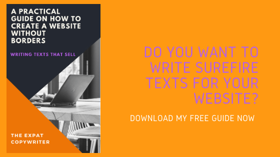
Do you want to know more about copywriting and user experience-based design?
Subscribe to my list and receive 2 emails a month with everything I know about the subject.
See you around!
[BTEN id=”120″]

0 Comments