
And keep the most important message.
It’s true. People don’t always read all the copy.
So how do you make sure that the person who lands on your website gets the key message to convince them that your product or service is better than the competition?
The copy is as important as the way it’s presented.
If you use tiny fonts, clumps of text, no room to breathe, no highlighting of ideas and no images, it will be almost impossible for people to read what you have to say.
That’s why it’s so important to know how to lay out your web copy.
In this copywriting lesson, we’ll look at the best techniques for making copy easy to read and scan.
What does scanning mean in this context?
It’s what you, me and everyone else does these days: we scan a page for the information we’re interested in without reading the whole thing, and if we don’t find it quickly, we walk away.
So let’s see how we can make people find the information they need and keep the key message of our sales copy.
Here we go.
The Headline
A weak headline which doesn’t attract the attention of your target customer is already a bad start.
The headline is the first obstacle you need to overcome, because if it isn’t powerful or compelling enough, you are not going to make your prospects stop and read the copy.
With the headline you allure your buyer persona into your universe by creating curiosity and teasing the benefit they can get if they read more.
There are many types of headlines but one of the formulas that works best is this one:
Tease the value of what you offer and embellish the benefit prospects will get.
This formula is what in copywriting we call fascinations and we use them in headlines but also in email subjects or product descriptions.
Recommended reading How to write fascinations
Headings
Once you’ve managed to make your prospects stay on the page, most of them will only stop and read what catches their attention.
If the copy is very well written and the person is really interested, they may read everything, but most of them will scan the copy looking for quick information.
So we need to highlight what we want to stay in the reader’s mind.
Headings help us guide the reader to where we want them to go, because they’re in a larger font, and even in a different colour, they won’t go unnoticed.
Use H1, H2 and H3 to summarise the key messages you want the reader to remember.
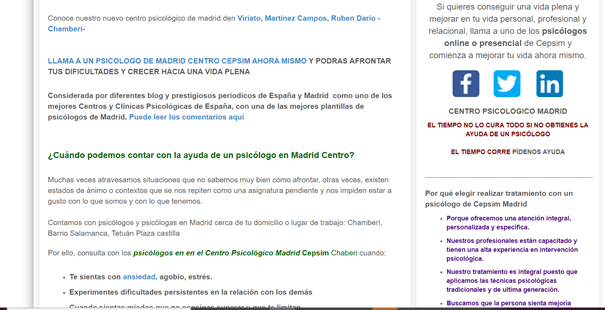
How to upload the copy to your website to make sure people read it #copywriting #uxdesign #webdesign #uxcopywriting Share on XLet’s look at an example.
Coach Accountable is an app for coaches to organise their work with clients. Clients can use the app to view materials, set reminders, etc.
Their home page is quite long because they need to explain why this app will improve people’s lives.
As there’s a lot of text, they use headings and colours to highlight the key points they want the reader to take away.
Italics, underlining and bold
Like everything else in life, if we overuse headlines, they will lose their power because they will no longer stand out and the reader will stop reading.
So we need to use other means of emphasising messages. We can use underlining, italics or bold.
In copywriting we often use this technique: from time to time we italicise a keyword that we want to emphasise in a sentence, we also do this to break up the monotony of the text.
Like here:
Bold words should be used with care because some people may only read those and not the rest, so they need to make sense on their own or make people curious to read the whole sentence.
How to upload the copy to your website to make sure people read it #copywriting #uxdesign #webdesign #uxcopywriting Share on XShort paragraphs and sentences
The Internet has changed the way we read. We don’t read a book in the same way we read a blog post.
When we search for information on the internet our brain is exposed to hundreds of images and messages, we are overloading it with stimuli, and that’s why it’s so hard to concentrate.
Help people concentrate on your copy by being concise and clear.
When writing for the web you sometimes need to explain a complex idea in a short paragraph. This isn’t easy, you learn with time and practice.
Paragraphs should be no longer than 4 lines and contain only one idea.
Avoid the passive voice and always use verbs in the active voice, the more vivid the better.
Break, jump, explode, conquer, win, flee, devour, love, explore, discover, risk, are examples of vivid verbs.
It all depends on the context, of course – selling fashion is not the same as selling a cancer research scanner.
But in any case it’s important to keep the reader awake and encourage them to take the action we want them to take (buy, contact us, subscribe to a list, etc.).
White space
With people spending an average of 6 hours and 42 minutes on the internet, with all the stimuli for the brain that this entails, you need to give them a chance to rest their eyes, so leave plenty of white space (or black space if you have a more sinister website).
This space will allow people to take a break and continue reading, but most importantly it will make the page look clean and tidy.
It’s like walking into a messy person’s bedroom and seeing everything lying around, clothes on the floor and on the bed, a desk full of junk, empty packets of crisps… You don’t know where to look and you want to run away.
The same thing happens to a person who lands on a website and sees endless blocks of text without any breaks, with thousands of messages competing for attention in no particular order, and with ads moving around the sides.
DON’T
However, if a site is tidy, with blocks of text in different formats, with some white space in between, with double columns for longer text, and without subscription boxes or annoying ads in the margins, the experience will be much more pleasant and you will be more likely to get your prospects to stay.
DO
Images
Images add aesthetic value, space and help get the message across.
When scanning a page, we tend to pay more attention to the text if it’s to the right of an image.
However, it’s useful to alternate the position of blocks of text and images because people tend to zigzag when reading a web page.
Images should complement the message we want to convey by adding more information about the product or service.
There are some businesses that, in an attempt to look cool, upload images that add irrelevant information or even confusing, distracting the reader from the main message.
If you think an image doesn’t add anything to the main message or might confuse the reader, just don’t include it.
If you’re a freelancer offering services, adding a photo of yourself will increase your credibility.
Putting a face to your services will help people trust you.
Large font
Why do so many designers insist on using a tiny font size?
The size here DOES matter!
It should be between 16 and 18 px, never smaller.
If it’s smaller than 16px, people might be super interested, but they’ll feel lazy because it takes more effort to read.
If you manage to convey your value with concise copy capable of convincing your ideal customer in a few words, choose an even larger font like Lemonpie does here.
Choose a simple, clean font like Montserrat, the whole Sans family, Raleway, and the like.
If you like more personal fonts like Swanky and Moo or similar, don’t overuse them.
It’s fine to use them for a header or a more personal short message, like a signature, but don’t write all the copy on your site in these types of handwritten fonts.
They’re tiring and don’t encourage people to read more than a few sentences.
To sum up
Your web copy can be jaw-dropping, but if the layout isn’t right, not even your mum will want to read it.
Be mindful of how you upload copy to your website and always think about the reader and how they will read it: In a hurry. ALWAYS.
Remember:
- Headlines that arouse curiosity and embellish a benefit.
- Headings that summarise the most important ideas.
- Underlining, bolding and italics to emphasise keywords and messages
- Short paragraphs and sentences
- White space
- Occasional but relevant images
- Clear and LARGE fonts
See you around!


0 Comments