
There are a gazillion studies concluding that images influence our emotions and therefore our purchasing decisions.
I’ve read a lot on the subject and with this mini copy class, I want to save you all the time I’ve invested in drawing the conclusions I summarise here.
We’ll see what kind of images work best on the internet and which ones you should avoid in any circumstances.
Because just as images can help you grab your prospects’ attention and enhance your offer, they can also do the opposite: that people ignore you or don’t get your message.
And to better understand how images influence people’s emotions we’ll look at some examples.
But don’t worry.
We aren’t only going to look at brands with huge advertising budgets, but also at the more mundane ones with whom we surely have more in common.
The main objective: to wake a sleepy audience up
Advertisers of decades ago already came to the same conclusion: the images that work best are those that catch the eye.
Those that break our default mental patterns and make us pay attention.
David Ogilvy, the father of advertising, said:
“What do work are photographs which arouse the reader’s curiosity. He glances at the photograph and says to himself, “What goes on here?” Then he reads your copy to find out. This is the trap to set. Harold Rudolph called this magic element “story appeal,” and demonstrated that the more of it you inject into your photographs, the more people will look at your advertisements. […]”.
If Ogilvy already thought like this before Instagram existed, imagine now with all these brands fighting to get our attention all the time.
We must elbow our way in – or rather use powerful images and copy – to get our prospects’ full attention.
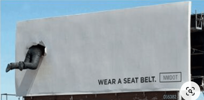
Sometimes the images are so powerful that they don’t need much copy:

And others in which the copy is what will make the message stronger:
Sometimes the impact of the image is created by the headline.
It might be a nothing-special photo but it’s the headline what grabs your attention:
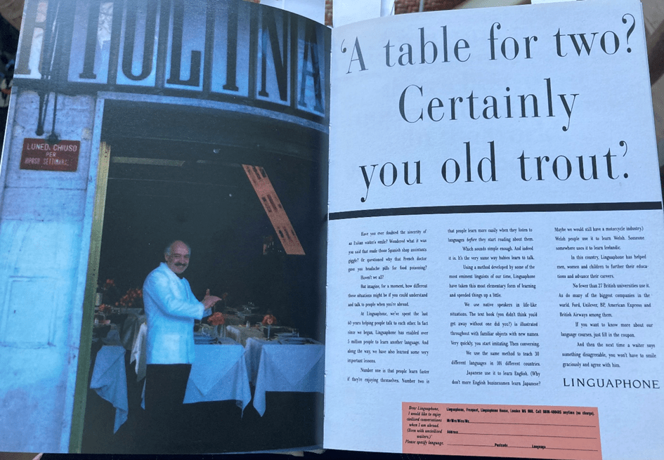
If you see that headline, you’re going to look at the ad for sure, because it’s shocked you. You ask yourself, but why is the waiter calling names to that customer?
The ad copy goes:
“Have you ever doubted the sincerity of an Italian waiter’s smile? Wondered what it was you said that made those Spanish shop assistants giggle? Or questioned why that French doctor gave you headache pills for food poisoning?
Haven’t we all? But imagine for a moment how different these situations might be if you could understand and talk to people when you’re abroad”.
The copy goes on talking about Linguaphone, a language school.
Here the image is nothing out of the ordinary but serves to illustrate and complement a powerful piece of copy.
The copy without the image wouldn’t work as well, and the image alone wouldn’t make people stop and read the ad.
Together, they tick all the boxes.
Let’s look at more examples so we can apply all these important lessons to our mundane businesses.
Want to attract attention? Choose the right images for your #website, #posts, and #ads. #copywriting #socialmedia #design #SmallBiz Share on XHow to use images to help you sell more
Choose images that help you convey your Unique Selling Proposition.
A website with images converts better.
They break the monotony of the text and help your website visitors understand concepts faster.
You should add images that help you convey your Unique Selling Proposition.
Let’s look at how I do it on my website.
My USP is that I give businesses a unique twist by creating original and compelling copy.
And I do that by shying away from boring and repetitive content everyone is using. What I call Zombie Copy.
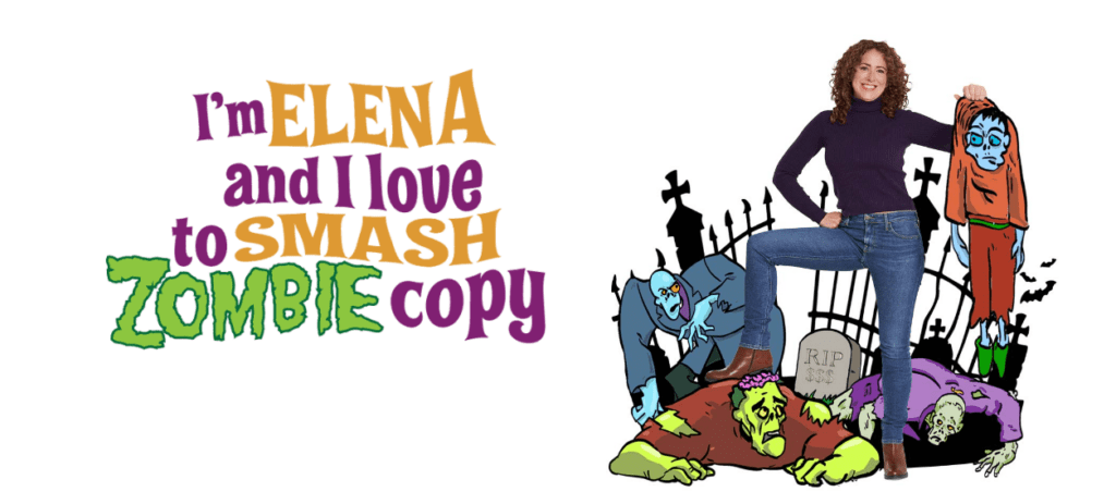
This image helps me convey my USP in a fun and memorable way.
Illustrations are a wicked way to be more likeable as a brand.
They help you stand out from your competition and convey your main benefits in an original and memorable way.
Lemon.io does it as well:
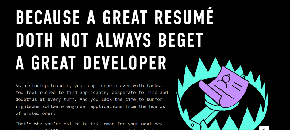
Lemon.io is a platform that connects developers with startups.
Their USP is that they make sure their devs won’t turn out to be a fiasco since they have to pass a series of tests before they can be part of Lemon.io devs pool.
The image of the CV in a trap help visitors grab their USP quickly summoning one of startups’ most recurrent pain points.
Lemon.io knows their prospects had bad experiences with developers in the past who weren’t as good as their CVs made them out to be.
Illustrations also give personality to your brand since they’re unique.
The illustrators and designers from La Bola Ocho created my website. Together we also work for clients who need copy and brand design.
If you need someone to design your logo, website, or packaging or help you stand out with funny and original illustrations, don’t hesitate!

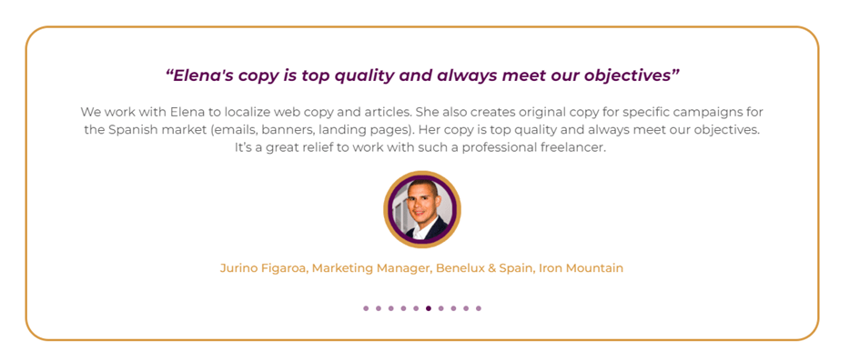
Images to build credibility
When you’re a service provider it’s important to show your face. Even if you’re a team.
Prospects want to see that you’re real people so they can trust your company to solve their problem.
That’s why you should show your faces on your About page. Or even on your Home page.
Moreover, images of people grab more attention because humans feel attracted by other humans.
And this principle also applies to customer testimonials.
Whenever possible add a photo of the person talking about their experience after working with you or buying your product.
Attention-grabbing images on social media
Social media has become a battleground where millions of brands fight for attention around the clock.
It can feel haunting.
But if we want to survive as brands we need to make some space for our businesses in this overcrowded party.
We’ve already seen some tricks to win this battle such as using images with people in them.
But you can’t post selfies all the time because you’ll be considered a narcissist. (And there are already too many around).
Use this resource for some of your organic posts but when it comes to ads better use images that grab people’s attention by breaking mental patterns.
You can do this by choosing images that have that “story appeal” Ogilvy talked about. Images that aren’t too common so when looking at them people wonder “What’s going on there?”
Or you can use images that aren’t so out of the ordinary but complement the copy and awaken people’s curiosity, as we saw with the image of the Italian waiter.
I’ll give you a real example of a product I worked with recently to show you how important the image is to enhance the copy.
This Spanish brand sells tablets to feel less hangover after drinking. For them, I wrote some emails and ads for Instagram and Facebook.
The copy of one of the ads said:
FORGET IT. HE’S NOT GOING TO SLEEP 2 HOURS LONGER BECAUSE YOU HAD A BIG NIGHT.
Don’t regret it.
One tablet just before you start drinking and a second one before you go to bed and forget the word hangover.
100% natural ingredients. No side effects. Ask for Sayonara at your local pharmacy.
This is the image I proposed to enhance the copy:
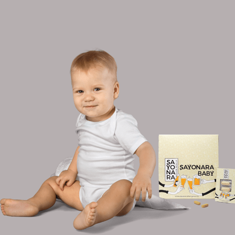
It was just to give them an idea, they didn’t have to use this exact one I’d created on Canva.
I chose this image because the baby looks you in the eye with that mischievous smile that goes perfectly with the headline.
Moreover, baby images attract a lot of attention because of our natural instinct to protect them.
But oh no!! My heart dropped when I saw the image they’d chosen for the ad:

The baby’s back is turned so there’s no connection with the audience and no mischievous smile directed at the viewer.
Besides, there are too many elements in that picture that distract from the main point. The baby.
With this image, I’m sure the ad won’t work as well. Such a shame!
So remember: if you want people to pay attention to your organic posts or ads:
- Choose an image that creates a connection with the viewer and enhances an already powerful headline.
- Or a shocking image that breaks mental patterns and attracts all the looks
Like:
This ad is from an insurance company.
And yet most insurance companies still insist on using boring images and bland copy…
Want to attract attention? Choose the right images for your #website, #posts, and #ads. #copywriting #socialmedia #design #SmallBiz Share on XImages to sell an experience
And by experiences, I don’t just mean tours, amusement parks or festivals.
Often a product is also an experience.
Air stream knows this very well when selling their caravans.

They sell the experience you’ll live with it, not the caravan itself.
When selling experiences choose images that anticipate the joy of living that precise moment.
Images that generate the desire to be there and nowhere else.
Better show common and real people because it’s easier to identify with them. Models with perfect bodies and faces aren’t always the right choice, they seem too unattainable and therefore less relatable.
Want to attract attention? Choose the right images for your #website, #posts, and #ads. #copywriting #socialmedia #design #SmallBiz Share on XImages to express a benefit
Images can help you express all the benefits of your product at a glance.
A perfect example of what I mean here is this one:
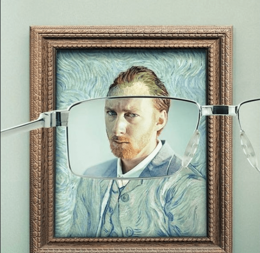
This ad is for Keloptic, a French optician brand, created by the agency Y&R Paris.
It’s striking because it ticks all the boxes:
- It breaks our mental patterns (we’ve never seen Van Gogh’s face so clearly in one of his self-portraits) and therefore it forces us to look and pay attention
- and it expresses at a glance the main benefit of their product.
Images also serve to demonstrate other types of benefits.
For example, size, as Squareup does to show the compactness of their chip readers:
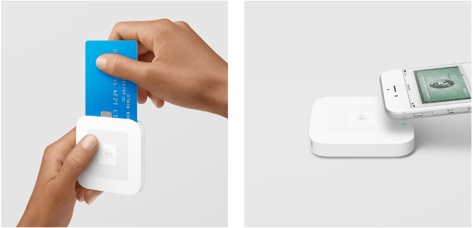
You can also demonstrate the size of your product by taking the photo from below and putting your product next to other objects that serve as a reference.
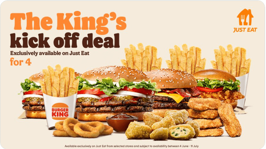
Burger King does it to show their burgers are big:
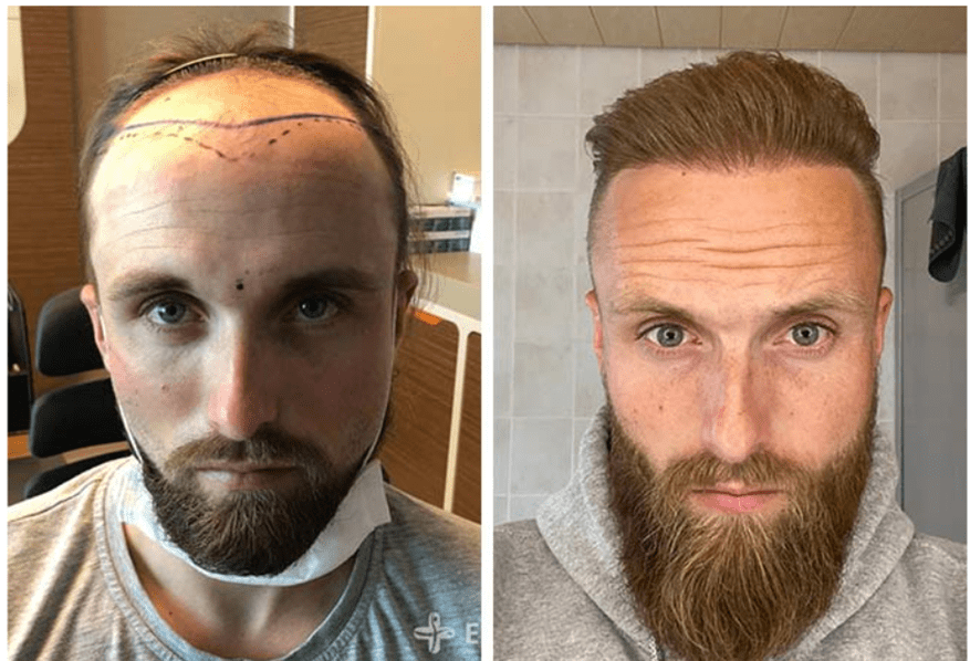
The before/after images work very well in many cases to show the benefits of your product or service. Like this one of a hair transplant clinic:
Which images not to use
- Don’t choose bland stock images. Like those of people working on a MacBook with a latte.
These photos don’t contribute anything and won’t help you stand out because you can see exactly the same ones in different places. They don’t compel any benefits, they aren’t striking and they don’t make people want to be there at that moment.
- Photos of large groups of people don’t work as well because it’s more difficult to identify with one of them.
Best use images of individuals or small groups.
- Be careful with images that are too heavy and slow down your website.
Use a plugin to optimise the images’ size. I use optimizador.io.
- Poor quality images. If you don’t want people to think your company is shoddy, watch out for those blurry, low-resolution images.
Don’t upload photos that have been sent to you via WhatsApp. They always lose in quality.
- Images of beautiful landscapes that have nothing to do with your product or service.
I see this a lot. Coaches, SaaS companies, plumbers, whatever, who randomly add in a picture of some snowed peaks and a blue lake.
These images serve no purpose to your business. Visitors haven’t landed on your website to look at pretty landscapes. They just want to find our quickly how you can help. Use images that make sense and help you express your value.
- Metaphorical images that confuse the message
Imagine you are a coach and you say on your website “Take the bull by the horns” and you decide to accompany the copy with a picture of a bullfighter.
This image may confuse your reader. What’s this? A coach or a bullfighting school?
Keep in mind that people often don’t read the whole copy, but scan it and read only single sentences.
Want to attract attention? Choose the right images for your #website, #posts, and #ads. #copywriting #socialmedia #design #SmallBiz Share on XTo sum up
Before choosing an image for your website or socials ask yourself these questions:
- Is there a clear advantage? For example, does this image present my product or service well?
- Does it help people understand what I mean?
- Does this image create an emotional appeal? For example, does it help prospects visualise themselves using the product pictured?
- How does this image relate to my brand and does it appeal to my target audience?
- What message does this image send – if any?
- How will prospects respond to this image and will it change their opinion? For example, will it help facilitate the buying process?
If you aren’t sure about the answers to these questions, think again before uploading that image.
Maybe you want to choose a different one that better conveys what you want to transmit and that will attract your prospects’ attention.
I hope this mini-copy class has helped you better understand how to choose your images.
Now you know how important images are to enhance your copy and vice versa!
See you around!
Want to attract attention? Choose the right images for your #website, #posts, and #ads. #copywriting #socialmedia #design #SmallBiz Share on X
Great Blog